
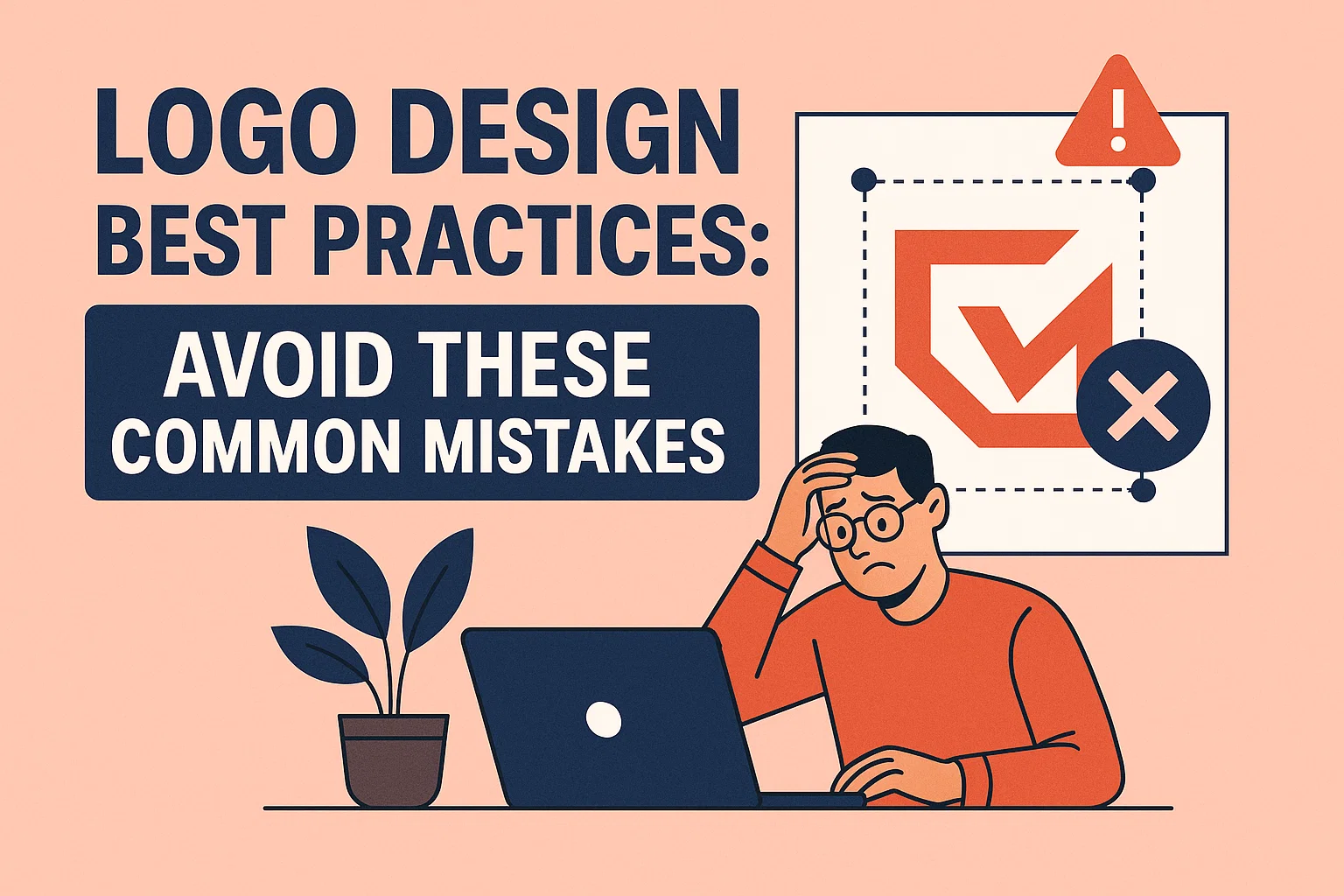
Your logo is one of the most crucial elements of your brand’s identity. It’s the face of your business, representing your values, mission, and vision. A strong, well-designed logo can help attract customers, build trust, and establish a memorable brand presence. However, many businesses fall into the trap of making logo design mistakes that hurt their brand’s image and hinder growth.
In this blog, we’ll explore logo design best practices and highlight common mistakes to avoid, ensuring your logo is effective, timeless, and stands out in today’s competitive market.
1. Overcomplicating the Design
One of the most common mistakes in logo design is making the design too complicated. A cluttered logo with too many elements can confuse your audience, diminish its impact, and make it difficult to scale across different mediums.
Logo Design Best Practices
A great logo should be clean, straightforward, and easily recognizable. Use simple shapes and clear lines that can be easily scaled without losing impact. Think of iconic logos like Apple, Nike, and McDonald’s—they’re simple yet instantly recognizable.
2. Ignoring Scalability
Your logo will appear in various formats, from business cards and websites to billboards and social media profiles. If your logo is overly detailed or too complex, it may not scale well, losing clarity when resized.
Best Practice: Design for Versatility
Make sure your logo works across all platforms, from small icons on mobile devices to large signage on storefronts. Test your logo at different sizes to ensure it remains clear and effective in all forms. Avoid overly intricate details that will get lost when the logo is reduced.
3. Using Trendy Design Elements
While it can be tempting to follow design trends, relying too heavily on trends can lead to a logo that quickly feels outdated. A logo design should be timeless, something that can grow with your business and remain relevant for years.
Best Practice: Design for Longevity
Instead of jumping on the latest design bandwagon, focus on creating a logo that reflects your brand identity and values. A timeless design will stay relevant even as trends come and go. Consider logos like Coca-Cola or Pepsi, which have stayed true to their original designs over time.
4. Forgetting About Color Psychology
Colors play a critical role in logo design because they evoke emotions and associations in your audience. Choosing the wrong color palette for your logo can unintentionally send the wrong message or fail to communicate the essence of your brand.
Best Practice: Understand Color Psychology
Each color communicates different emotions and messages. For example:
- Blue: Trust, professionalism, and calmness (ideal for corporate or tech companies).
- Red: Energy, excitement, and passion (great for food, entertainment, or sports brands).
- Green: Growth, sustainability, and health (perfect for eco-friendly or wellness brands).
- Yellow: Optimism, creativity, and cheerfulness (often used by startups and creative agencies).
Ensure that your logo’s colors reflect the emotions you want to evoke and resonate with your target audience.
5. Using Too Many Fonts
Fonts are essential to your logo design, but using too many can make it appear disjointed and hard to read. Multiple fonts can create confusion, and it can be difficult for your audience to quickly understand what your brand is about.
Best Practice: Limit Fonts to One or Two
Stick to one or two complementary fonts in your logo. Ideally, use one font for the company name and another for any tagline or supporting text. Sans-serif fonts are modern and clean, while serif fonts give a more traditional or professional look. Ensure your typography matches the tone and message of your brand.
6. Overusing Special Effects
Adding special effects like shadows, gradients, or 3D elements may seem tempting to make your logo look unique, but these effects can make your logo look dated and unprofessional. Special effects also complicate the design, making it harder to reproduce in different sizes or formats.
Best Practice: Keep It Clean and Simple
Stick to a flat design that works well across all digital and print mediums. If you want to add depth or dimension, consider using subtle elements like a simple gradient or slight shading. Avoid heavy 3D effects, glows, or bevels that may detract from the simplicity and effectiveness of your logo.
7. Failing to Align with Brand Identity
A logo is the visual representation of your business. If your logo doesn’t align with your brand identity, it won’t effectively communicate your business’s mission, values, and personality.
Best Practice: Ensure Alignment with Your Brand
Before designing your logo, take the time to define your brand’s identity—your values, tone, and target audience. Your logo should reflect these elements and communicate your message to your audience. For example, a law firm might use solid, traditional colors and serif fonts to convey trust and professionalism, while a startup tech company may opt for modern, bold designs to evoke innovation and energy.
8. Ignoring Cultural Sensitivities
If you’re designing a logo for a global brand or targeting an international audience, it’s important to consider cultural differences. Some colors, symbols, or shapes may carry unintended meanings in certain cultures, which could affect how your logo is perceived.
Best Practice: Do Cultural Research
Make sure your logo design doesn’t inadvertently offend or confuse potential customers in different regions. Research the cultural meanings of colors, symbols, and shapes to ensure that your logo resonates well across all markets. For instance, red is a lucky color in China, but in some cultures, it can signify danger or warning.
9. Using Clipart or Stock Images
While stock images or clipart may seem like a quick and easy solution for your logo, they can make your brand look generic and unoriginal. Using pre-made designs fails to distinguish your brand and diminishes its uniqueness.
Best Practice: Create a Custom Logo
Your logo should be unique and reflect your brand’s personality. Custom logos that are tailored to your brand will help you stand out from the competition. Work with a professional designer to craft a logo that represents your business authentically.
10. Not Testing the Logo Across Different Platforms
A logo needs to look great in multiple formats—whether it’s on your website, social media, business cards, or physical signage. Failing to test how your logo appears across these platforms can result in a logo that doesn’t work as well in some spaces.
Best Practice: Test Across Multiple Platforms
Before finalizing your logo, test how it looks in various sizes and on different backgrounds. Make sure it’s easily recognizable and legible on digital screens, print materials, and large signage. A great logo is versatile and works well across all mediums.
Conclusion: Create a Logo That Speaks for Your Brand
A well-designed logo is more than just a pretty picture—it’s a powerful tool that communicates your brand’s identity, builds trust with your audience, and helps you stand out in a competitive market. By avoiding these common logo design mistakes and following the best practices outlined above, you can create a logo that resonates with your audience and leaves a lasting impression.
At Cybertech Innovations, we specialize in creating custom logo designs that reflect your brand’s unique values and identity. Let us help you design a logo that captures your business’s essence and makes a memorable impact.
Frequently Asked Questions (FAQ)
FAQ 1: How long does it take to design a logo?
The timeline for logo design can vary depending on the complexity of the design and the number of revisions. On average, it can take anywhere from a few days to a few weeks. It’s important to ensure you allow enough time for research, concept creation, and feedback from stakeholders.
FAQ 2: Can I use a free logo maker or do I need a custom logo?
While logo makers may seem convenient, they often lack the uniqueness and personalization that a custom logo design provides. A custom logo is tailored to your brand identity and is more likely to stand out from competitors. Free logo makers also often rely on templates, which may not give your brand the professional image it deserves.
FAQ 3: How do I know if my logo design is good?
A good logo is simple, memorable, and versatile. It should clearly reflect your brand’s identity and resonate with your target audience. Test your logo across different platforms, check for scalability, and ensure it’s easily recognizable and legible at all sizes.
FAQ 4: Can I change my logo after it’s been designed?
Yes, you can update or refresh your logo over time, especially if your brand evolves or if your logo starts to feel outdated. However, major logo redesigns should be approached with caution as it can affect brand recognition. If you do redesign, try to keep core elements of your original logo to maintain familiarity.
FAQ 5: How much does a custom logo design cost?
The cost of a custom logo design varies depending on the complexity of the design and the experience of the designer. On average, a logo design can cost anywhere from $100 to $1,000 or more. It’s essential to invest in a logo that reflects your brand’s professionalism and values, as it will serve as the foundation for your brand identity.